JavaScript charting tools have been marked by continuous evolution, from simple line and bar charts to sophisticated, interactive visualizations that can handle massive datasets with ease. Initially, charting in JavaScript was largely limited to static images or basic, interactive elements. However, with the advent of HTML5 and improvements in web standards, there has been a seismic shift towards more dynamic, customizable, and responsive charting solutions.
Libraries such as D3.js, Chart.js, Highcharts, SciChart and many others have emerged, each offering unique features and capabilities. D3.js, for example, is renowned for its flexibility and powerful data-driven approach, allowing for intricate visualizations that are limited only by the developer’s imagination. Chart.js shines in its simplicity and ease of use, making it an ideal choice for quick deployments and projects with straightforward requirements. Highcharts, on the other hand, caters to enterprise-level applications, offering extensive documentation and support for complex charting needs.
Customization at Its Core
One of the primary reasons JavaScript charting has become so prevalent in Britain is its unparalleled customization capabilities as we can see here https://www.scichart.com/javascript-chart-features/ . Developers have the freedom to tailor every aspect of the charting experience, from the visual design to the interaction mechanisms. This customization is not just about altering colors or fonts but extends to the core functionality of the charts themselves.
Interactive dashboards are a prime example of this customization. By leveraging JavaScript’s dynamic nature, developers can create dashboards that not only display data but also allow users to interact with it in real-time. Users can filter datasets, drill down into specific data points, and even manipulate data on the fly. This level of interactivity enhances user engagement and provides deeper insights into the underlying data.
Accessibility is another area where customization plays a critical role. Ensuring that charts are accessible to users with disabilities is not just a legal requirement but a moral imperative. JavaScript charting libraries have made significant strides in this area, offering features like keyboard navigation, screen reader support, and alternative text for graphical elements. By customizing these features, developers can ensure that their charts are inclusive and accessible to all users.
Pushing the Aesthetic Boundaries
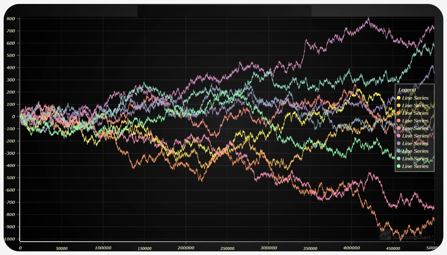
The aesthetic appeal of a chart is not merely about making it “look pretty.” It plays a crucial role in how effectively the chart communicates data. A well-designed chart can highlight key trends, draw attention to important data points, and make complex datasets understandable at a glance. JavaScript charting libraries offer extensive customization options for aesthetics, including animations, gradient fills, and custom shapes.
Moreover, with the rise of big data, the challenge has shifted from simply displaying data to doing so in a way that is both informative and visually appealing. Developers are increasingly experimenting with novel visualization techniques, such as heat maps, tree maps, and even three-dimensional charts. These innovative approaches not only capture the audience’s attention but also provide new perspectives on the data, revealing patterns and insights that might not be apparent from traditional chart types.
Towards Responsive and Scalable Charting
The proliferation of mobile devices has necessitated the development of responsive charting solutions that can adapt to various screen sizes and resolutions. JavaScript charting libraries are inherently suited to this task, offering flexibility in design and layout that static charting methods cannot match. By employing responsive design principles, developers can ensure that their charts are accessible and legible on any device, from desktop monitors to smartphones.
Scalability is another critical consideration, especially for applications that deal with large volumes of data. JavaScript charting tools are increasingly incorporating advanced data handling techniques, such as lazy loading and incremental data fetching, to manage performance and ensure a smooth user experience. These techniques allow charts to display initial datasets quickly, then fetch additional data as needed, without overwhelming the browser or the user.
Case Studies: Innovation in Action
Across Britain, from London’s financial district to Edinburgh’s tech hubs, organizations are leveraging JavaScript charting to transform data into actionable insights. For example, a leading British financial institution implemented a real-time stock market dashboard using Highcharts, enabling traders to monitor market trends and make informed decisions quickly. This dashboard integrates streaming data feeds, allowing for dynamic updates and interactive elements, such as zooming into specific time frames and comparing multiple stocks simultaneously.
Another fascinating case involves a climate research team at a British university employing D3.js to visualize complex climate models and simulation data. By creating interactive maps and global temperature charts, they’ve been able to communicate the urgency of climate change more effectively to policymakers and the public. These visualizations make abstract and complex data tangible, highlighting trends and potential future scenarios in a compelling way.
Leveraging Advanced Functionalities
Beyond basic charting capabilities, extending JavaScript charting possibilities involves tapping into advanced functionalities that these libraries offer. Features such as real-time data updating, custom event handling, and integration with other web technologies open up new avenues for data visualization.
- Real-Time Data Updating: For applications requiring up-to-the-minute data, such as financial dashboards or live monitoring systems, JavaScript charting libraries support real-time data updating. This ensures that the visualizations reflect the current state of the data, essential for decision-making in fast-paced environments.
- Custom Event Handling: Interactive charts can respond to user actions, such as clicks, hovers, and drags, to provide additional information or change the displayed data. This level of interactivity enhances user engagement and allows for a more detailed exploration of the data.
- Integration with Web Technologies: JavaScript charting doesn’t exist in isolation but can be integrated with other web technologies, such as WebGL for 3D visualizations and Web Workers for background data processing. This integration expands the possibilities for creating innovative and complex visualizations that are both informative and visually stunning.
Overcoming Challenges
While extending JavaScript charting possibilities opens up new frontiers in data visualization, it also presents challenges. Performance optimization becomes crucial as datasets grow larger, requiring efficient data handling and rendering techniques to maintain a smooth user experience. Accessibility remains a key concern, ensuring that visualizations are usable by everyone, including those with disabilities. Overcoming these challenges involves a combination of technical skills, creative thinking, and a commitment to inclusive design.
The Future of JavaScript Charting
Looking ahead, the future of JavaScript charting is bright, with emerging trends such as AI-driven data visualization and immersive VR/AR data experiences promising to further transform how we interact with data. As these technologies mature, they will offer unprecedented ways to visualize and understand complex datasets, making data more accessible and actionable than ever before.
Conclusion
JavaScript charting possibilities are vast and varied, offering a rich canvas for developers and data scientists to present data in engaging, informative, and accessible ways. Whether through enhancing interactivity, pushing aesthetic boundaries, or leveraging advanced functionalities, the exploration of these frontiers is just beginning. As technology evolves, so too will the ways in which we visualize and interpret the world’s data, making JavaScript charting an exciting area of development for years to come.